Like most people, I’ve spent countless hours this past year-and-a-half doing online conferencing and watching many speakers present virtually – as well as having Zoom / Teams meetings with clients and colleagues. And it’s occurred to me that the Covid online era has for the first time invited us directly into the homes, offices and living rooms of the people with whom we work.
And along the way it’s given us an insight into other people’s lives and living circumstances, as we have met and viewed each other’s families, flat-mates, pets, gardens, pot-plants, sofa’s, paintings……and especially bookshelves.
Full disclosure – when I’m involved in online conferences, I can’t help looking behind and beyond the presenters and check out their home environment and especially their bookshelves, because the ‘bookshelf background’ is often the scenery of choice for many online presenters. I’m embarrassed to admit that every time US Chief Medical Officer Anthony Fauci appeared on the news, from his home office, I was more fixated on the interesting items on his shelves than his insightful thoughts on the pandemic.

And if I have Zoomed with any of you, dear readers, I will admit to having looked behind you at what you have in your homes, your artworks, your family photos and especially what you are reading. I can’t help it!
And my main learning is this: other people’s homes, offices and especially bookshelves are way cooler, more interesting, more scholarly and overall more appealing than mine. Yes, I have bookshelf envy.
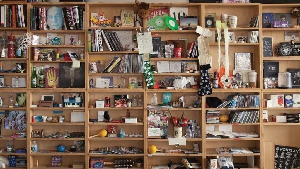
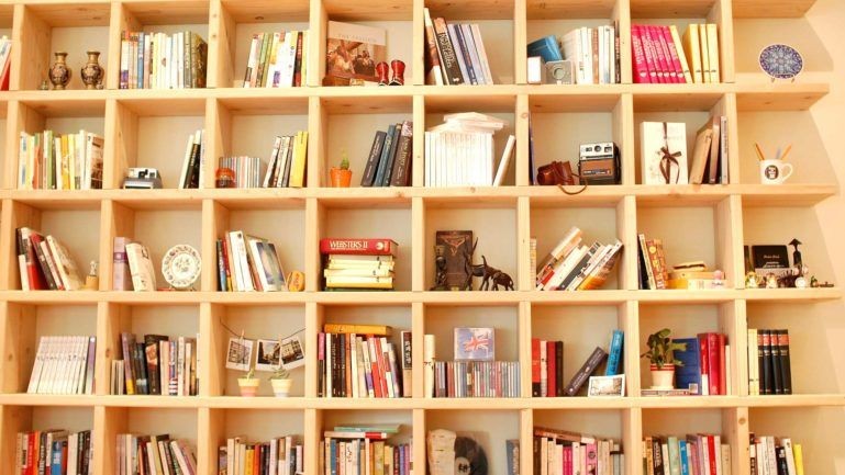
Somehow everyone else seems to have a more organised, more cohesive, more geometrical and more colourful bookshelf than mine. And I’ve spent a long time since Covid making my own bookshelf look as cool as possible!! But I’m still in awe of everyone else’s. Many presenter’s bookshelves look like they’ve come direct from an IKEA catalogue or that Marie Condo herself has come over and styled these rooms! And I’m not talking about the fake virtual backgrounds, I’m talking real live home-offices and shelving units.
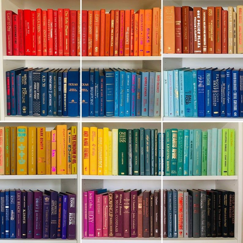
And don’t even get me started on those people with colour-coded bookshelves!!!! OMG. I do think the colour-coded bookshelf looks amazing, but I can’t help thinking it must say something about the bookshelf owner and their personality. I’m no psychologist so I offer no comment………other than it looks great. And better than mine.

So what wisdom am I imparting in this article? From an online presentation skills perspective, hats off to all those presenters with beautifully organised backgrounds. A simple and neat background definitely looks more professional and less distracting from a viewer perspective. It is definitely worth spending a bit of time curating your background to make it look as simple and uncluttered as possible. A plain white wall is not distracting but it’s a little bland and personality free. A bit of colour goes a long way.
But please don’t go over the top with the bookshelf perfection look. It’s making many of us feel inadequate and having to manage our 2020-21 bookshelf envy. You know who you are.
Maybe take one for the team and mess it up just a little.

This article first appeared in the May edition of Business Events News. (BEN).

